Abuelita’s Grocery Store
Identity, Website, Print Design, and Packaging
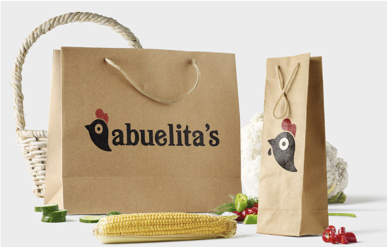
Abuelita’s is a Central American exclusive imports grocery store and eatery. This fictional grocery store was inspired by Kitchener–Waterloo’s local Latino community.
The objective of the design was to produce a friendly and reliable identity that could communicate with a Spanish-speaking audience and still accommodate English speakers. The inspiration for warm, festive colours and Mesoamerican design elements resulted in the creation of Abuelita’s design system.
Including bold reds that recall the lively culture to the deep blues from the oceanic coasts resulted in the bold colour scheme. Accompanied by a friendly sans-serif typeface, the brand becomes approachable to a wider audience and invokes curiosity. Further completed with an icon of a rooster enhancing the brand identity’s playful theme, and calling back to the strength and reliability of the brand.